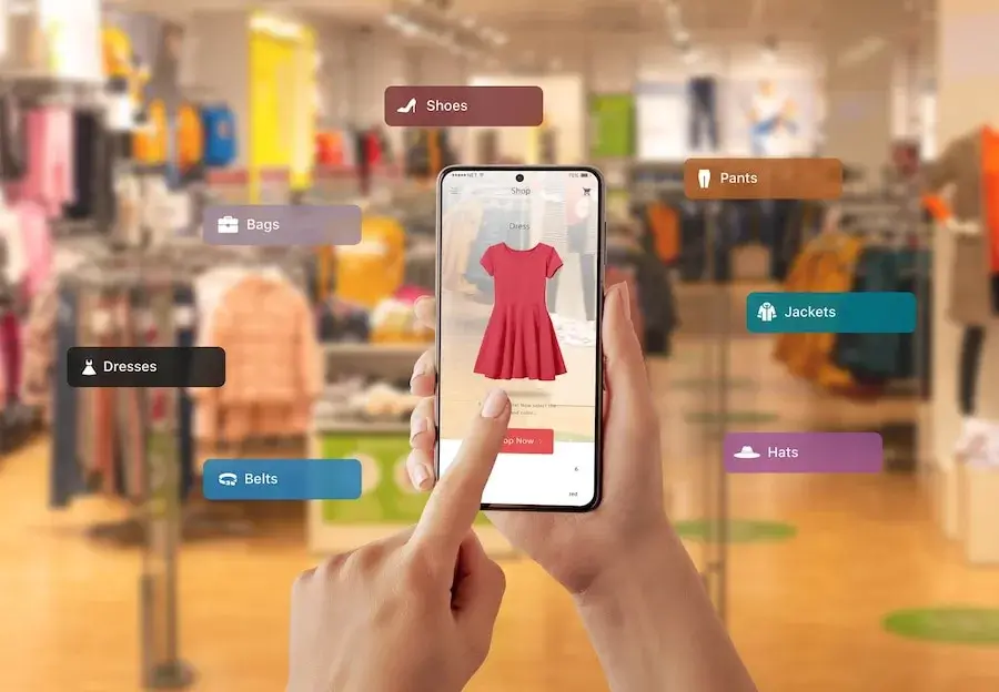
In today’s digital landscape, mobile devices have become the primary gateway for online activities. With the ever-increasing number of users accessing the internet on smartphones and tablets, it is crucial for businesses to prioritize responsive design, especially when building a Shopify store. In this blog post, we will explore why responsive design matters and how you can create a mobile-first Shopify store that delivers a seamless user experience across all devices. As experts at WebSeoWiz Tech, we understand the importance of responsive design in maximizing conversions and customer satisfaction. Let’s dive in!
The Rise of Mobile Commerce:
The rapid growth of mobile commerce, or m-commerce, has revolutionized the way consumers shop. Studies show that more than 50% of online purchases are made on mobile devices. This shift in consumer behavior necessitates a mobile-first approach when developing an e-commerce platform like Shopify. By prioritizing responsive design, you ensure that your store caters to the needs and preferences of mobile users, enhancing their shopping experience and ultimately driving sales.
Benefits of Responsive Design:
Responsive design offers a multitude of benefits for your Shopify store. Firstly, it provides a consistent and cohesive user experience across devices, regardless of screen size or orientation. This consistency builds trust and encourages visitors to explore your products or services further. Additionally, responsive design positively impacts your search engine rankings, as search engines prioritize mobile-friendly websites in their results pages. Improved visibility leads to increased organic traffic and potential conversions.
Mobile-First Approach:
Adopting a mobile-first approach means designing your Shopify store with mobile devices as the primary focus. This strategy involves creating a layout and user interface that is optimized for small screens, touch interactions, and limited data connections. By prioritizing the mobile experience, you ensure that your store loads quickly is easy to navigate, and provides a seamless checkout process, all of which contribute to a positive user experience and higher conversion rates.
Designing for Mobile:
When designing your Shopify store for mobile, consider the following best practices:
- Simplify the interface: Prioritize essential elements and minimize clutter to ensure a clean and intuitive user interface.
- Mobile-friendly navigation: Implement a streamlined navigation menu that is easy to access and navigate on small screens.
- Fast loading times: Optimize image sizes, enable browser caching, and minimize unnecessary code to ensure speedy page load times.
- Thumb-friendly buttons: Make sure buttons and clickable elements are large enough for easy tapping, minimizing the risk of user frustration.
- Responsive imagery: Use responsive image techniques to ensure that visuals adapt to different screen sizes without sacrificing quality or loading times.
Testing and Optimization:
After implementing responsive design principles, it is crucial to thoroughly test your Shopify store on various devices and screen sizes. Conduct user testing to identify any potential issues or areas for improvement. Regularly monitor user behavior and make data-driven decisions to optimize the mobile experience further. Keep an eye on loading times, user flow, and conversion rates to continuously enhance the performance and usability of your mobile-first Shopify store.
Conclusion:
In the mobile-centric world, we live in, responsive design is no longer an option but a necessity. By prioritizing mobile-first development for your Shopify store, you provide users with an exceptional shopping experience across all devices, improve search engine visibility, and boost conversions. At WebSeoWiz Tech, we recognize the significance of responsive design and are dedicated to helping businesses create mobile-friendly e-commerce platforms. Embrace the mobile revolution and make responsive design a cornerstone of your Shopify store development strategy, ensuring your brand’s success in the ever-evolving digital landscape.


